Overview
Overview
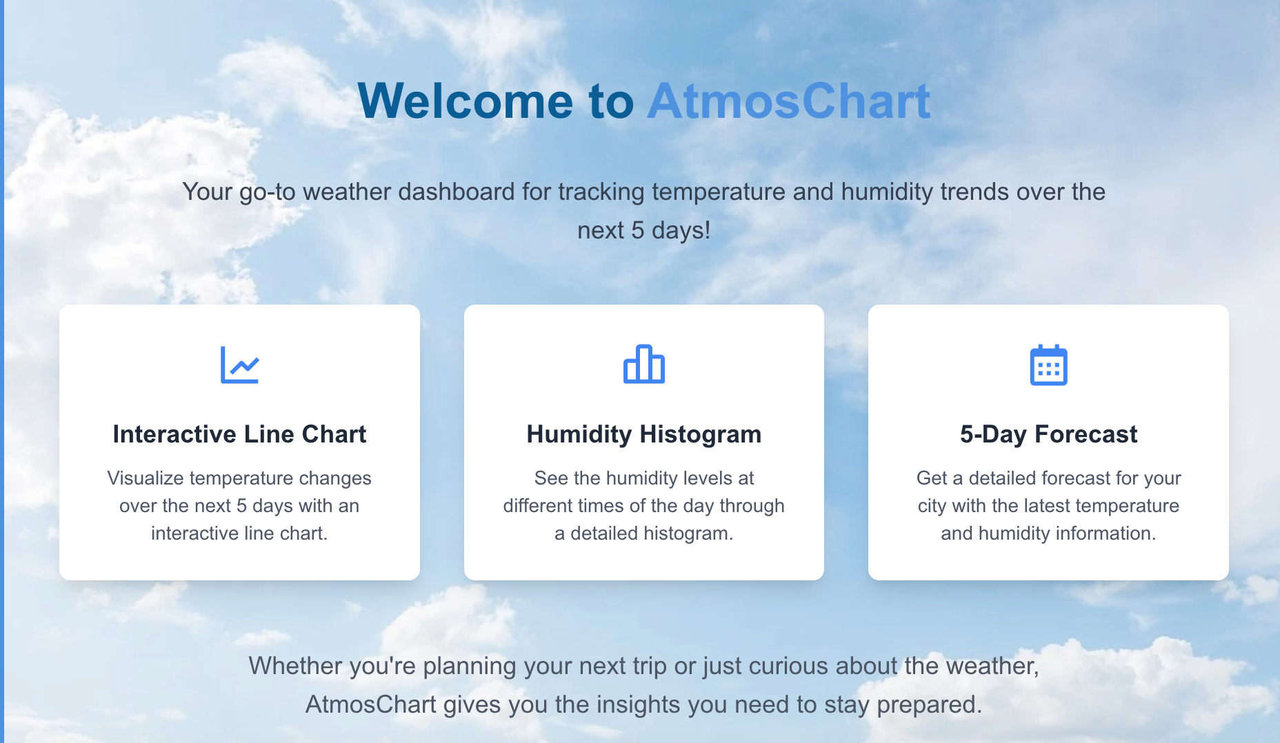
AtmosChart is a weather visualization tool designed to make temperature and humidity trends immediately understandable, rather than overwhelming users with raw numerical data.
Most weather apps prioritize data volume. This project prioritizes data comprehension.
What I built
A responsive web application that visualizes atmospheric data through:
- Temperature trend lines
- Humidity comparisons
- Clean, minimal chart interfaces
- Responsive layouts for different screen sizes
The app focuses on presenting just enough data to reveal patterns without clutter.
What I learned
The biggest insight was that data visualization is more about omission than addition.
Adding more data points or chart elements doesn’t improve understanding — it often reduces it. The challenge is deciding what not to show.
I also learned:
- Chart performance is closely tied to React rendering patterns
- Small UI decisions (padding, axis labels, contrast) have large UX impact
- Choosing the right charting library depends heavily on the level of customization required